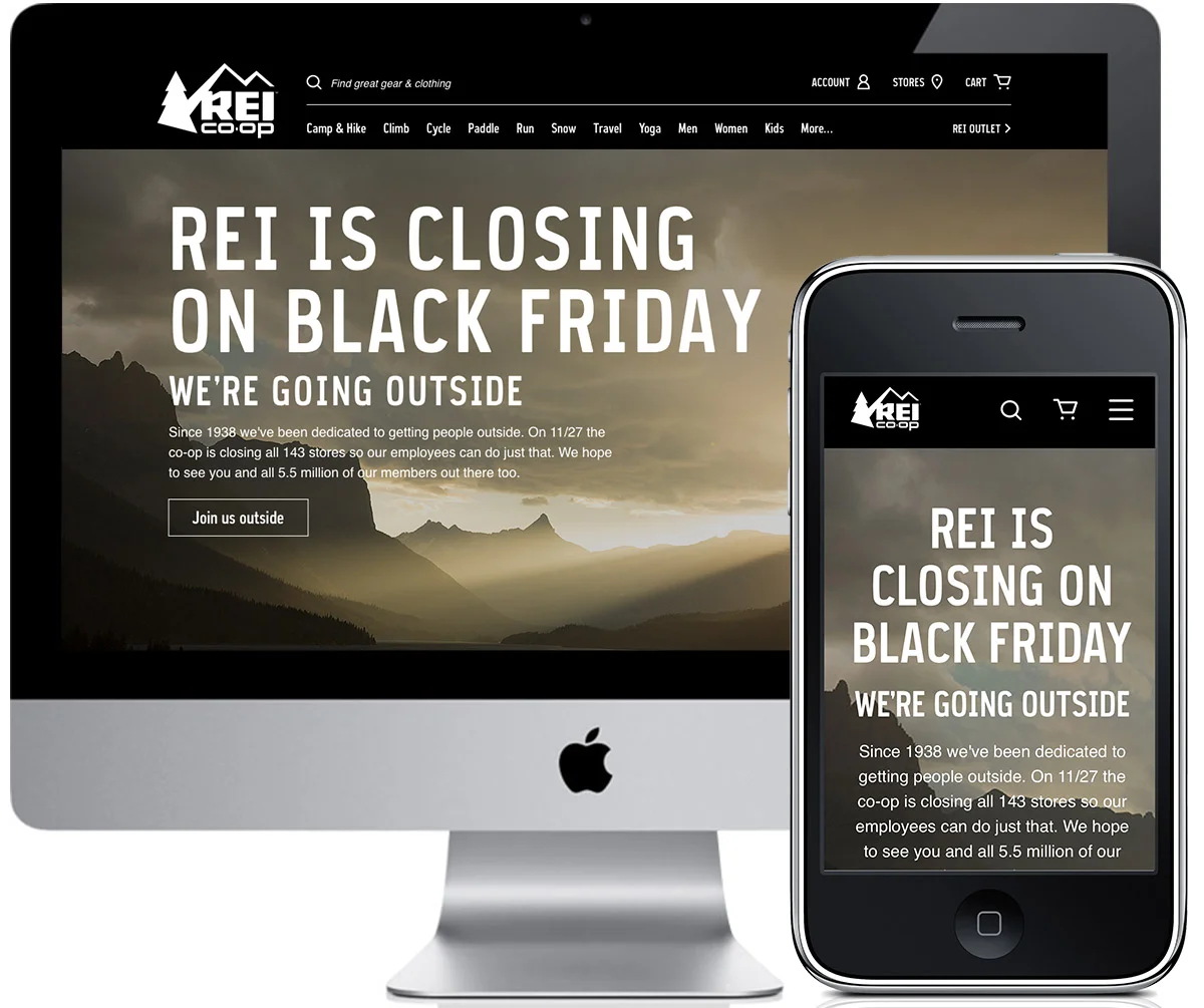
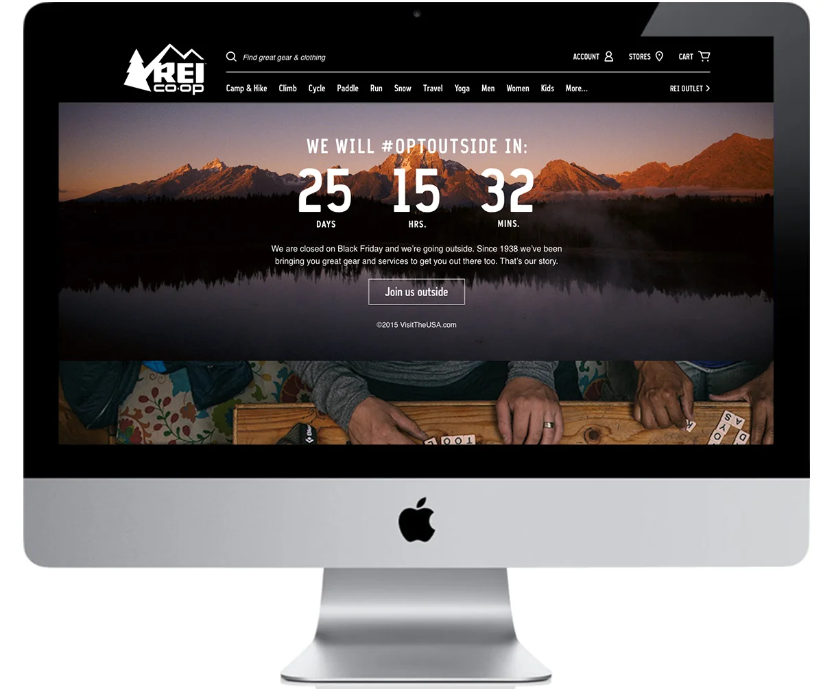
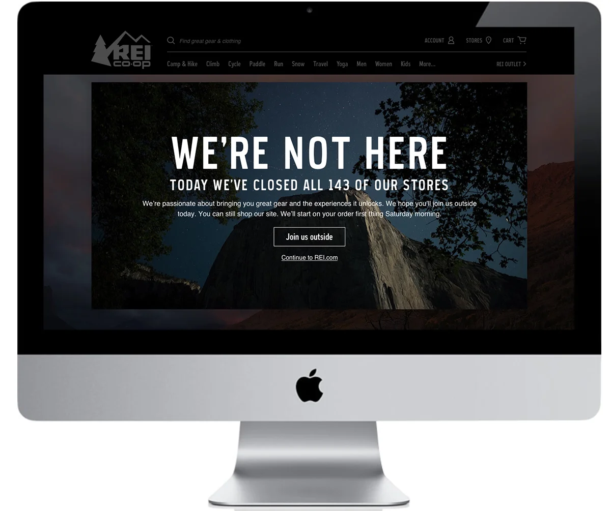
Objective:
REI announced it would close it's doors on Black Friday to get people to #optoutside instead of joining the craze of shopping.
Tactics:
A multimedia campaign was created that included print, social, television appearances, take-overs on REI.com and a landing page.
How it succeeded:
This campaign was even more successful than anyone had imagined. We received over 7 billion impressions in a month and over 1 Million people chose to #optoutside. And in partnership with Venables, Bell & Partners this campaign won the Titanium Grand Prix at Cannes.
My involvement:
I was responsible for designing all of the campaign pieces across REI.com, most notably the homepage and the takeover we implemented on Black Friday. Worked directly with the agency 22 North on the UX/UI of the landing page.
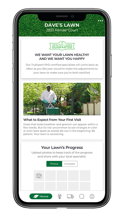
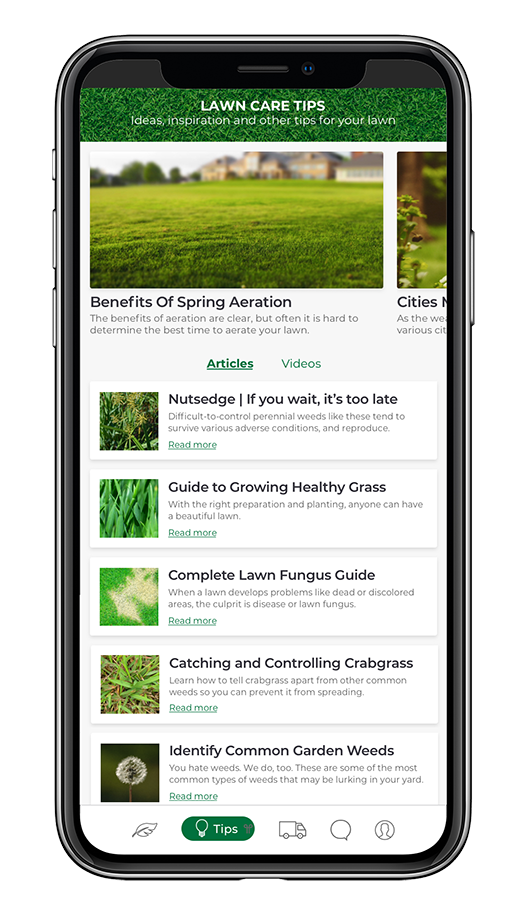
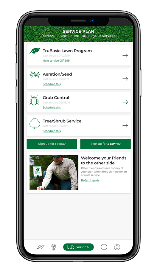
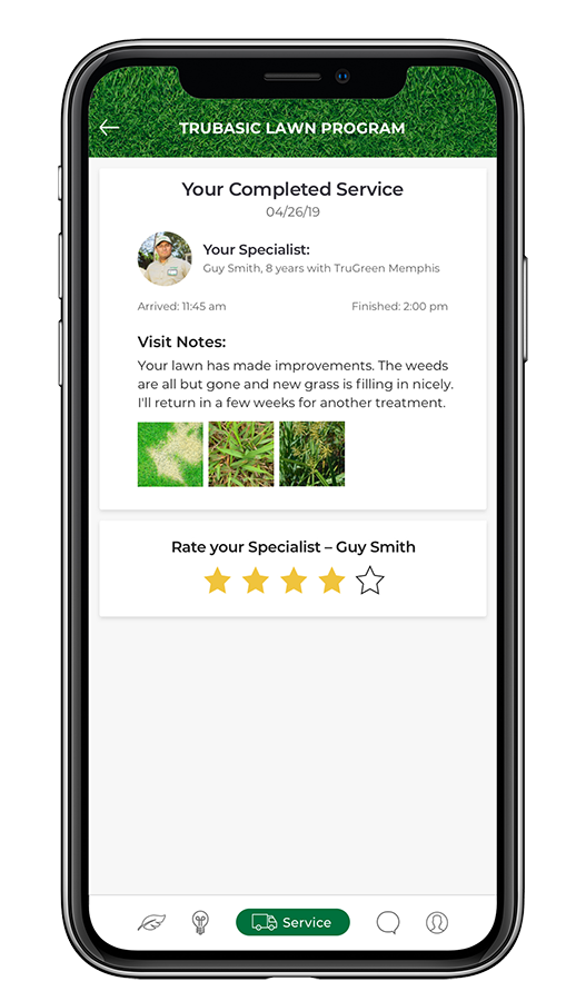
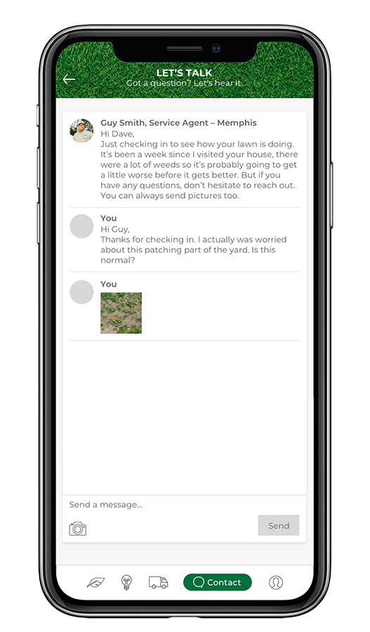
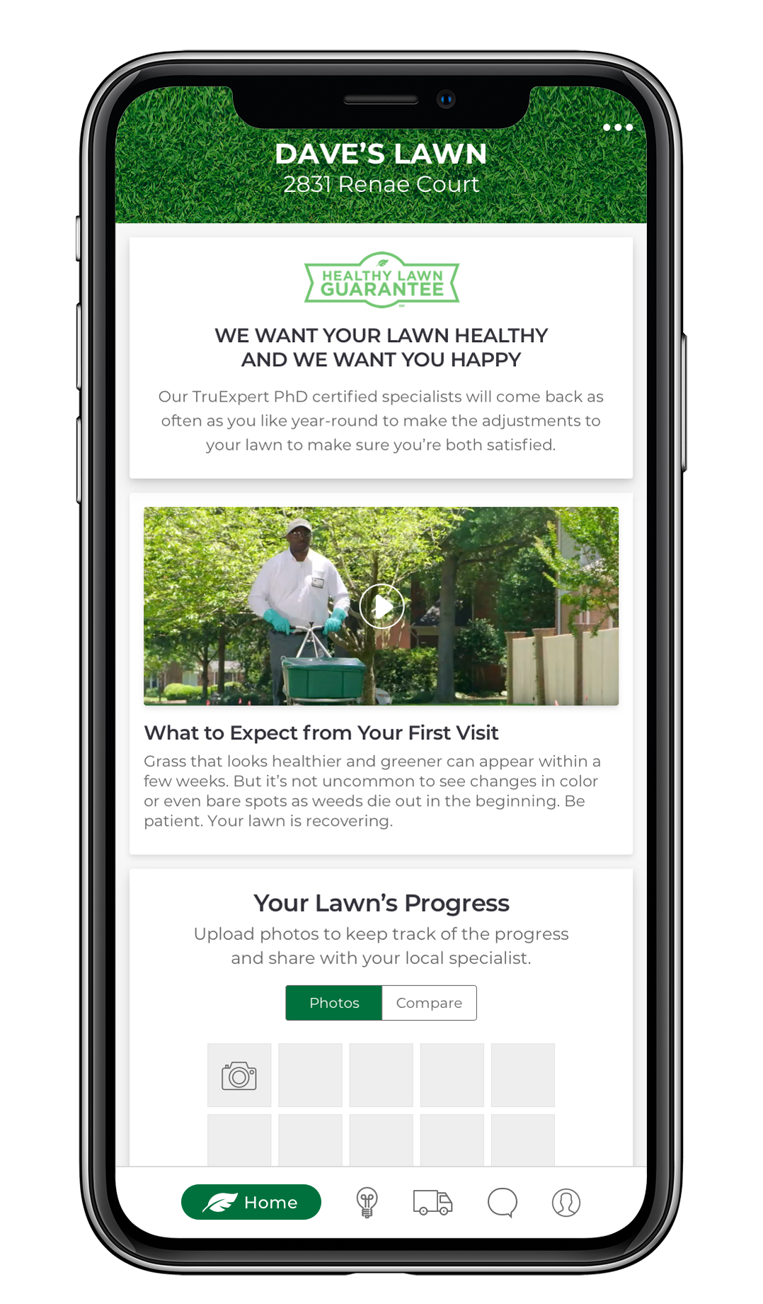
Objective:
Through social listening tools we discovered there were four main areas of complaint from customers and the reasons the retention rate was so low. One of those complaints was the lack of communication when they had issues. Therefore, the app was redesigned to be used as a retention tool and help create a less transactional experience and a more conversational relationship between lawn specialists and their customers.
My involvement:
Based on information from social listening, I was able to build out a framework of functionality that addressed the issues customers were encountering while using the service.
A high-fidelity prototype was then created for the pitch to TruGreen.
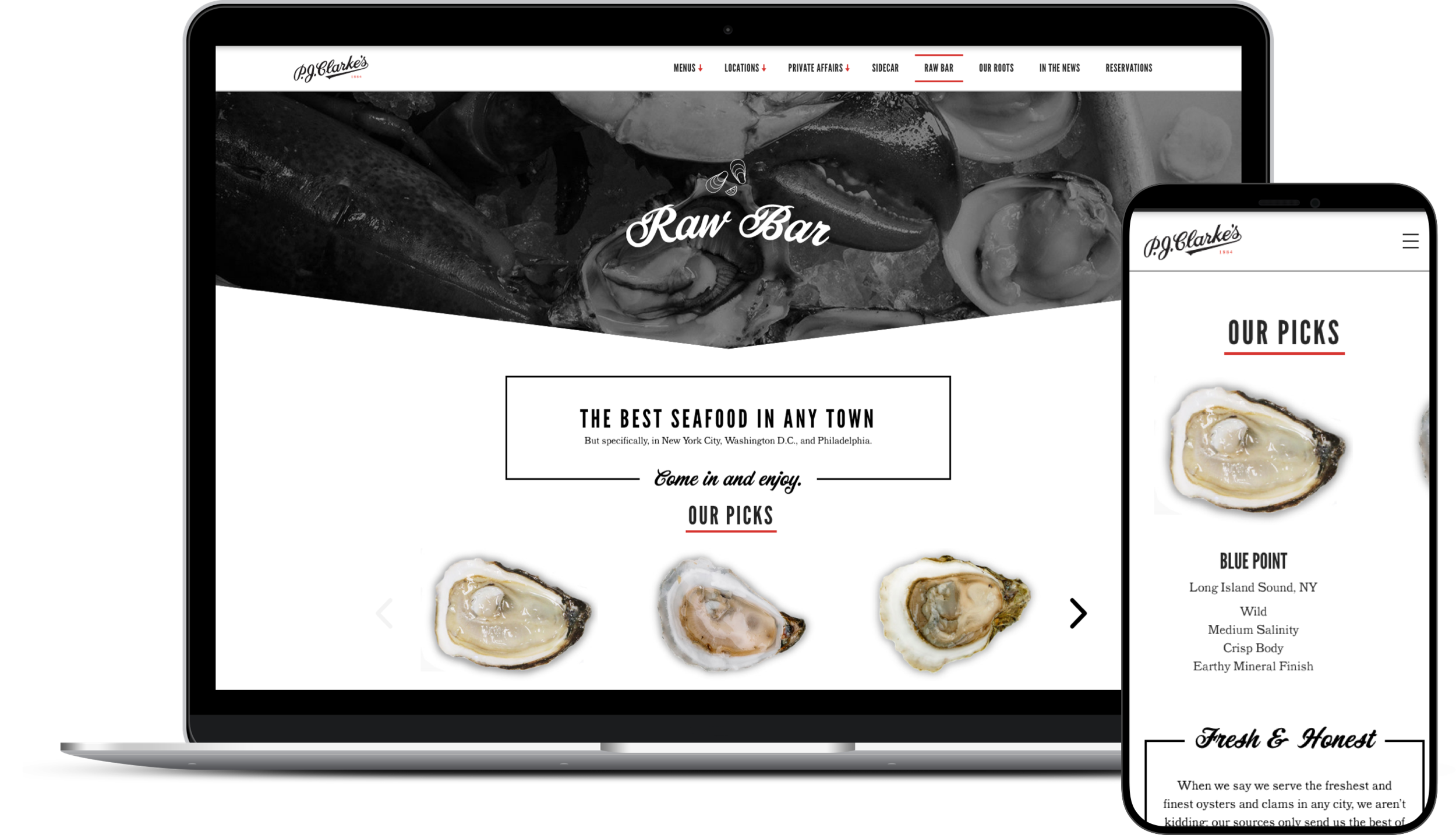
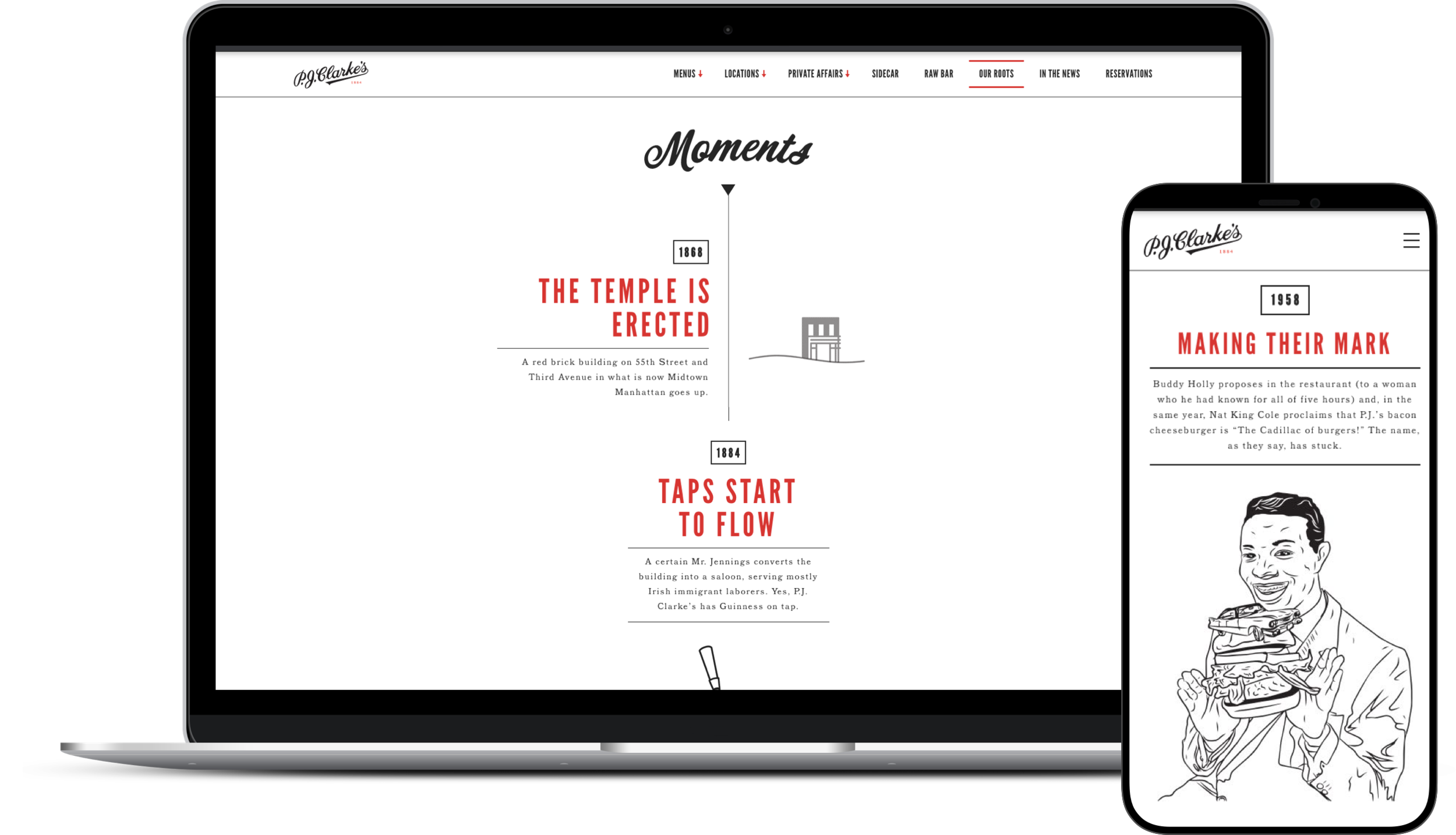
Objective:
P.J. Clarke’s needed a website facelift and an optimized user experience to help their customers, in multiple locations, find exactly what they were looking for. We created a homepage with geolocation to show the closest restaurant for the user, prominently showcased all location information, and really highlighted the Raw Bar that they are known for.
The restaurant also does a significant amount of business with private parties, but the user experience was very complicated and not sustainable for the private affairs team. That experience was streamlined both externally and internally.
The experience for their private club, Sidecar, also needed extra attention to make the digital experience as exclusive as the club. They were set up with a password protected page bringing them into a first-run quiz experience to allow P.J. Clarke’s employees to get better acquainted with each members preferences.
All our decisions needed to be user-friendly, accessible and aesthetically pleasing, but also easy to maintain by their interior team.
My involvement:
I restructured the site architecture, wireframed and designed all the pages and created the content strategy.
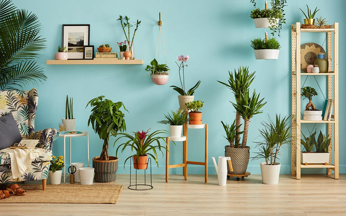
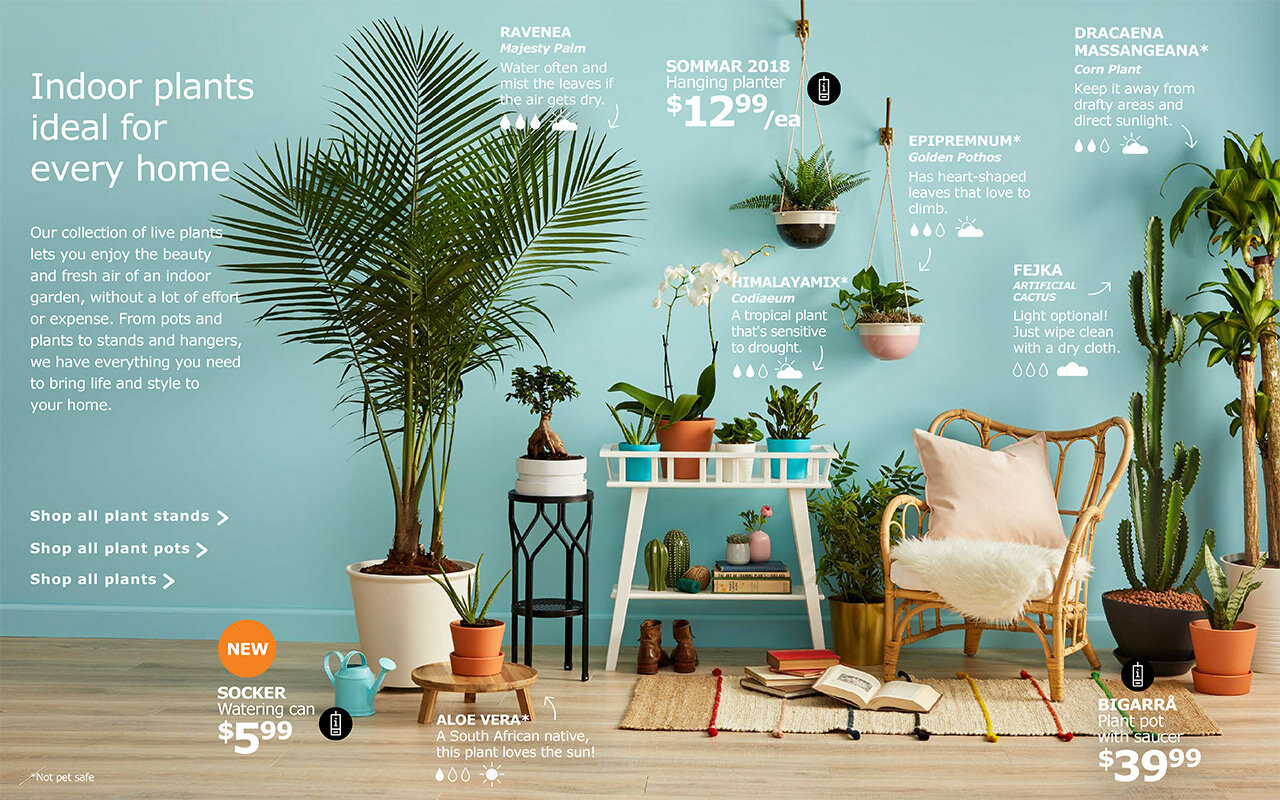
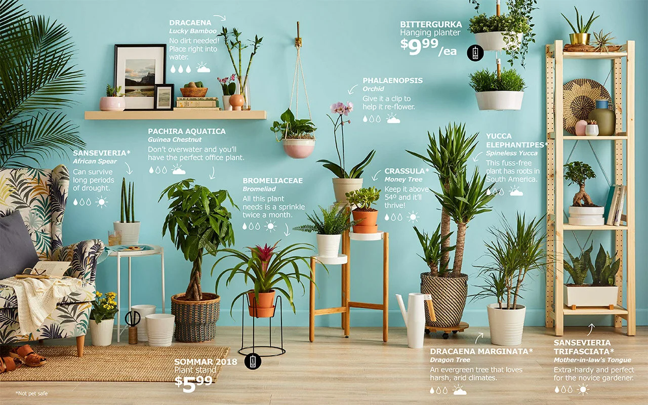
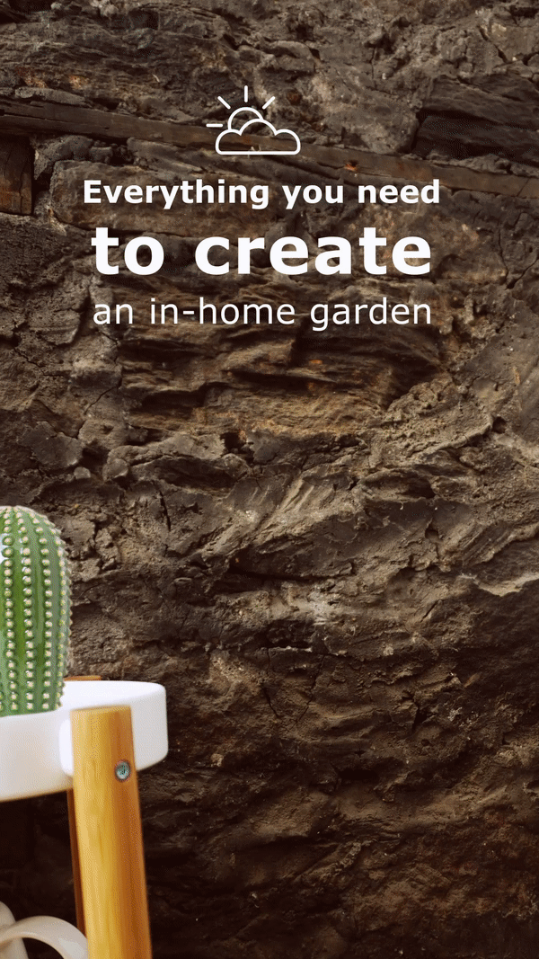
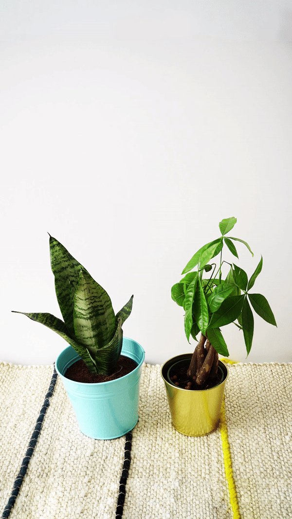
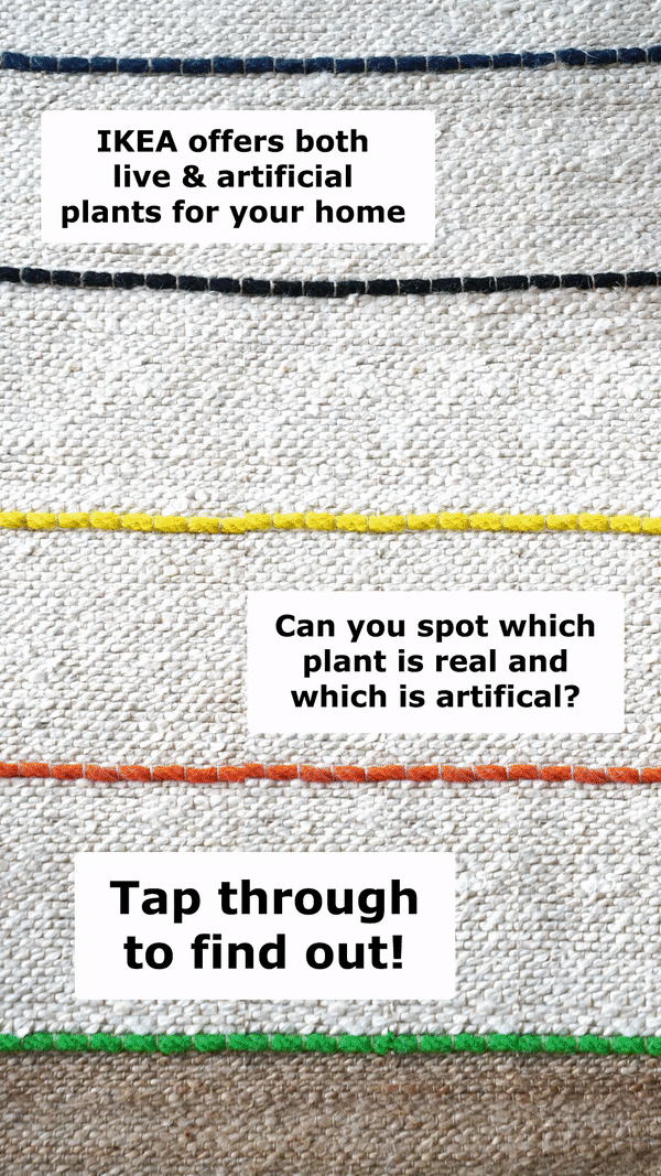
Objective:
Increase brand awareness of IKEA’s plant and gardening section while highlighting the variety of products for both urban and suburban homes.
Tactics:
Tapping into a growing trend of “plant adoption.” We worked alongside Pinterest to discover what content plant parents were searching for and developed a digital Plant Guide to help consumers with their purchase decisions. Working with a stylist we created special spread for the yearly “Living Indoors & Out” Digital Guide featuring the great plant and pot options. Additionally, videos were made for Instagram Stories, Facebook and Pinterest.
How it succeeded:
137K total organic engagements
14k total clicks to IKEA-USA.com from organic social content
60% increase in sales for pots and plants across all IKEA stores
My involvement:
As the Digital Creative Director, I helped conceptualize the project, coordinated with the photographer and stylist, and oversaw the photoshoot with my Art Director and Social Designers.
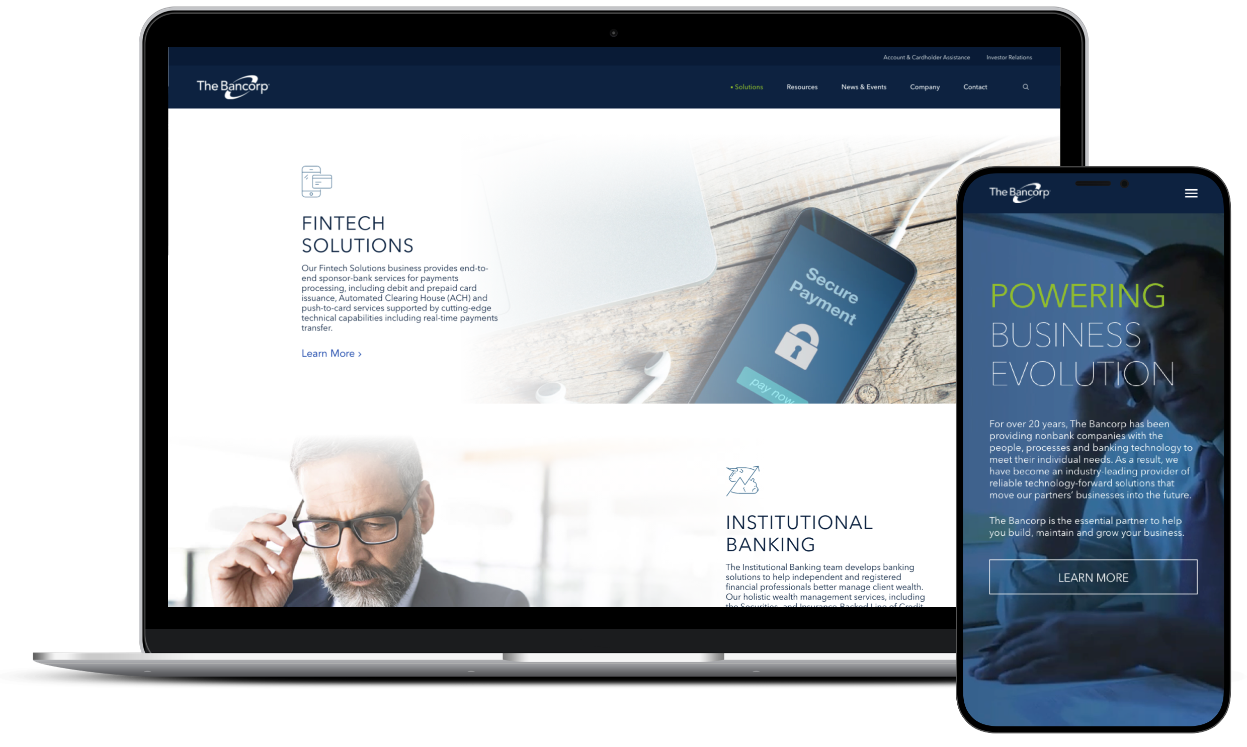
Objective:
To refresh the enterprise website in order to better position The Bancorp to its multiple audiences. Through this refresh, The Bancorp can present as the financial industry leader it is via an enhanced web presence and improved website messaging.
My involvement:
In addition to helping with the pitch to win this client business, I was an individual contributor working on the Information Architecture, site audits, UX design, and prototyping.
I worked with a Strategist to update the site architecture in alignment with the updated brand hierarchy. We also used this updated messaging hierarchy to create a content outline that ultimately informed my UX Design and wireframes. Using Invision, I created a low fidelity prototype of the full site to showcase functionality and the full modular design planned for the site.
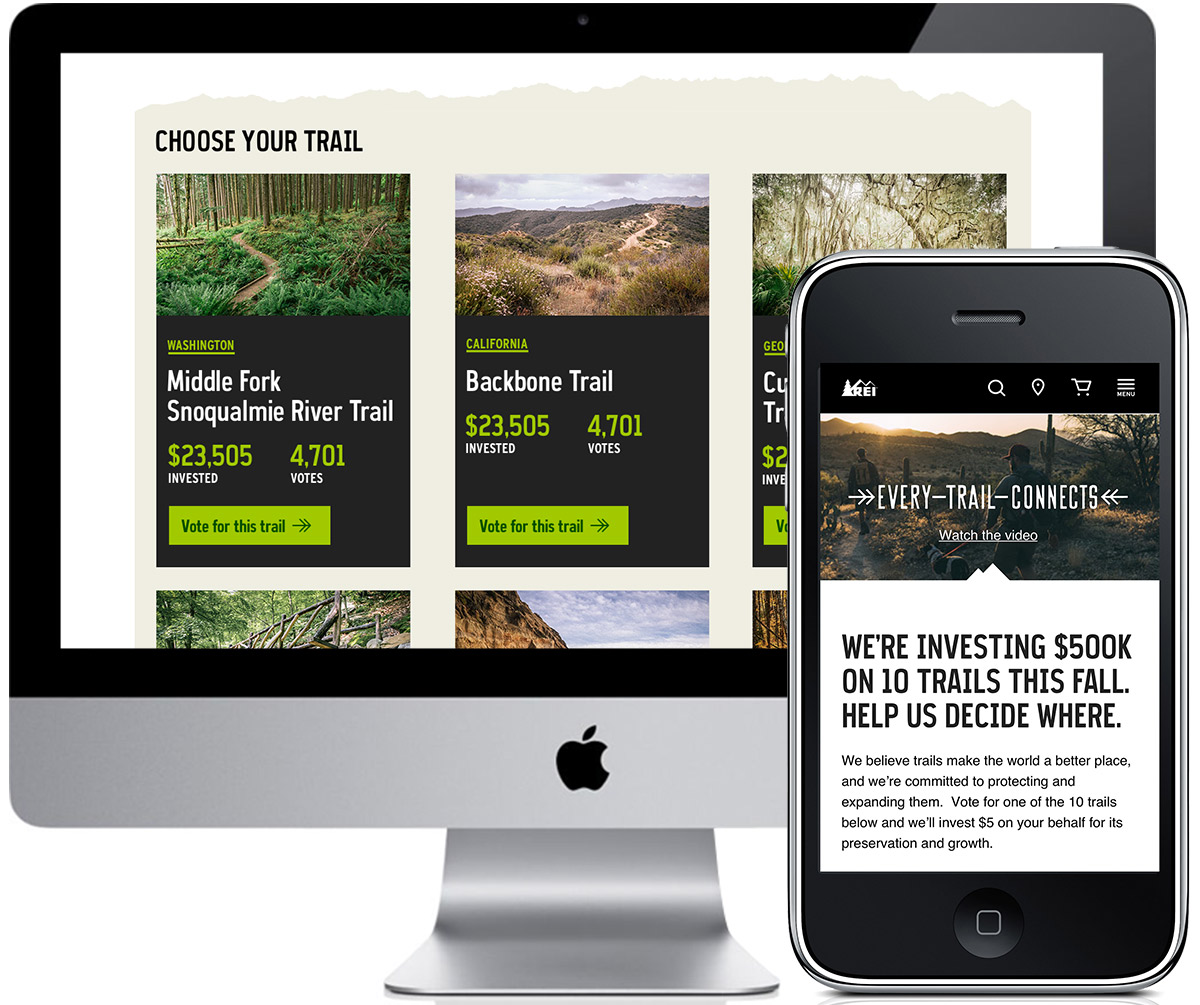
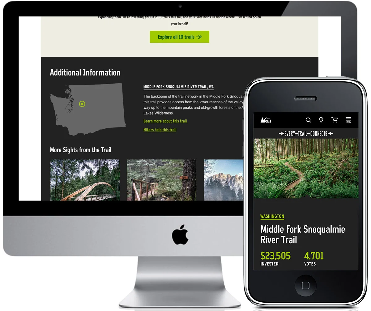
Objective:
REI had an extra $500,000 to donate and decided to have people help us figure out among 10 trails, where it should go. A person could vote once a day on a trail that needed help. Each vote equaled $5 and voting was open until the money was fully funded.
Tactics:
A multimedia campaign was created that included print, social, take-overs on REI.com and several landing pages; an overview page and a page for each trail.
How it succeeded:
The project fully funded in 30 hours.
My involvement:
I was responsible for the campaign landing page, all 10 trail voting pages as well as all the campaign pieces on the site.
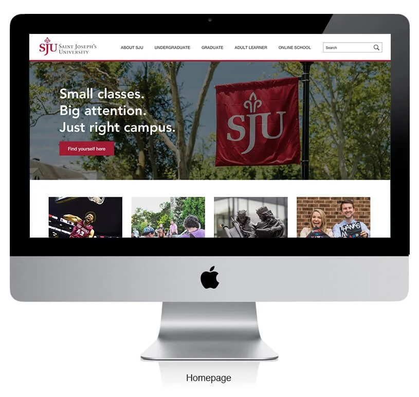
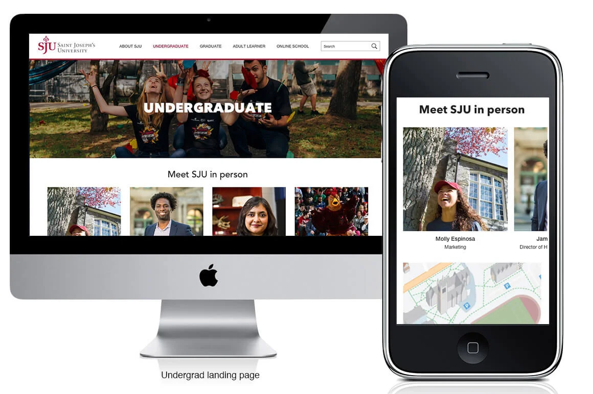
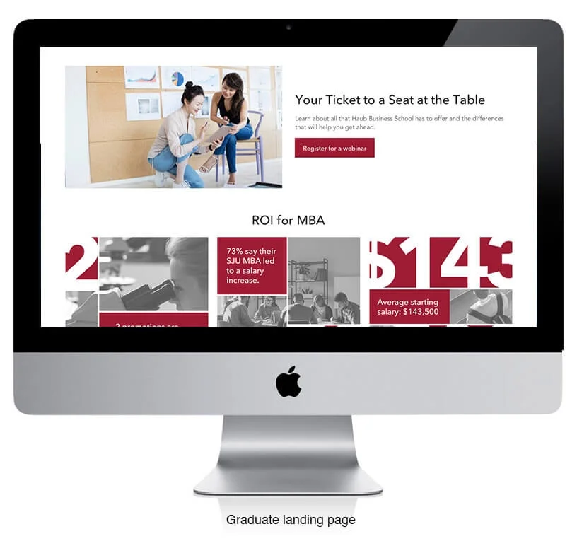
Objective:
As part of an RFP, we took a look at updating the site map and navigation of SJU’s website. We wanted to show them how they could optimize content and create a better user journey and user flow.
The website is to be used as more of a merchandizing tool, so the copy is value-proposition driven and there is a big emphasis on ROI, the inclusion of webinars for the graduates and a more immersive campus experience for the undergraduates.
Tactics:
We created an updated navigation, homepage, undergraduate landing page and a graduate landing page. The mobile landing page also drove you to an interactive map with a 360 on-campus experience.
My involvement:
I worked with my Lead UX Strategist to create and oversee the creation of wireframes and I did the high-fidelity mockups and prototyping. This was done in two presentation phases. One presented not in-person, so there is a “first-run” experience and the other was part of a larger in-person presentation.
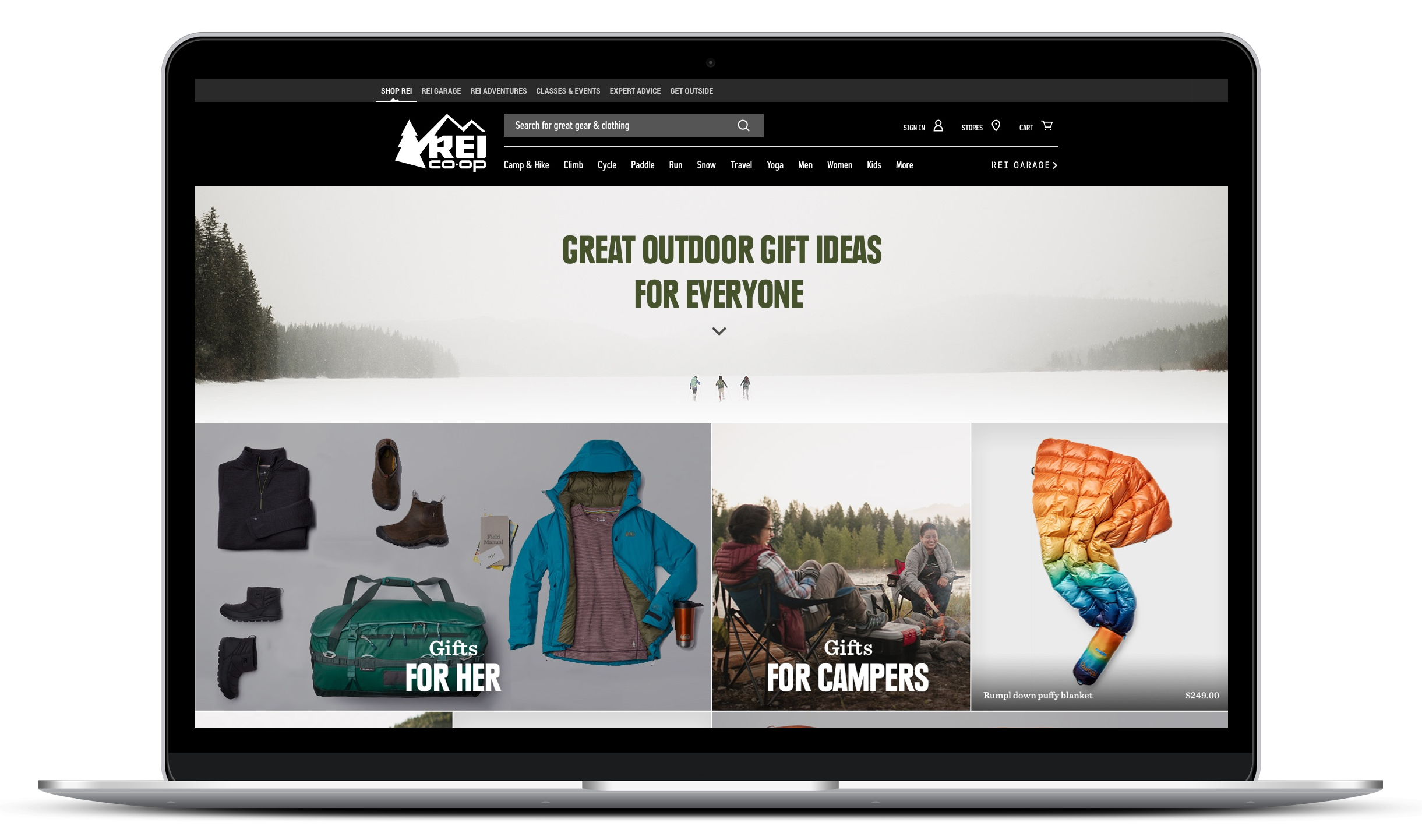
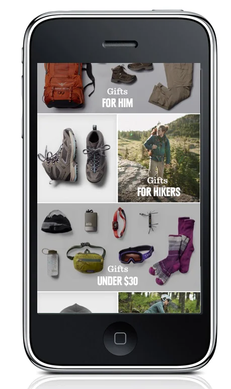
Objective:
Entice shoppers to buy their holiday gifts from REI featuring specific gift-buying categories, activities and products. We needed to give shoppers a more interesting and useful shopping experience while working with the sales teams to hit target numbers for the year.
Tactics:
Using user data from the previous year, we found which gift-buying categories were most clicked utilized. We then had to mix those with new activity specific categories and products.
Working with a UX designer, we did light user testing within the REI company to determine if people actually wanted to shop this way.
How it succeeded:
Internal user testing gave us an initial assessment of success, but the holiday gift center was also a huge success for sales. We far surpassed our target number for the year.
My involvement:
Working in conjunction with the internal marketing department and photo studio, I art directed and oversaw the photoshoot for all the product laydowns. I was also responsible for designing all of the campaign pieces across REI.com; homepage placements, site banners and the landing page (to the left).
Multi-Page Redesign - wireframes
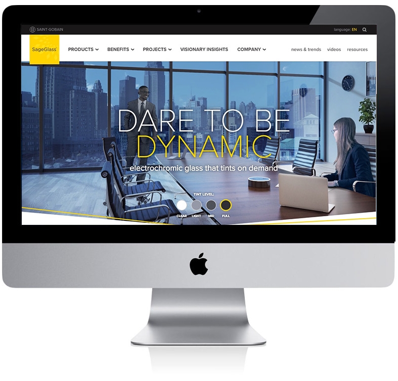
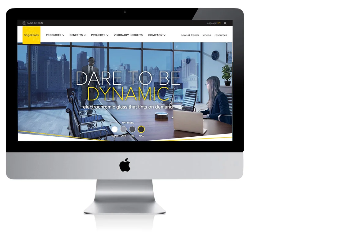
Objective:
SageGlass added to its product portfolio, so instead of having one page for their products, we needed to figure out a way to showcase three products within their site.
Once we dug into the content, we found pages that were not connected in anyway, so we came up with an idea for a short-term optimization that allowed for a better user experience. Adding in the benefits dropdown, allowed for users to find all that content from the top nav and within the pages themselves we included a right rail navigation that some pages had and some didn’t.
My involvement:
Based on information my Lead UX strategist obtained from a KPI workshop done with the clients; I worked with my Lead UX Strategist to create and oversee the creation of wireframes, the high-fidelity mockups and prototyping. I also did a slight design update to the pages, since we didn’t have the time to do a full redesign.
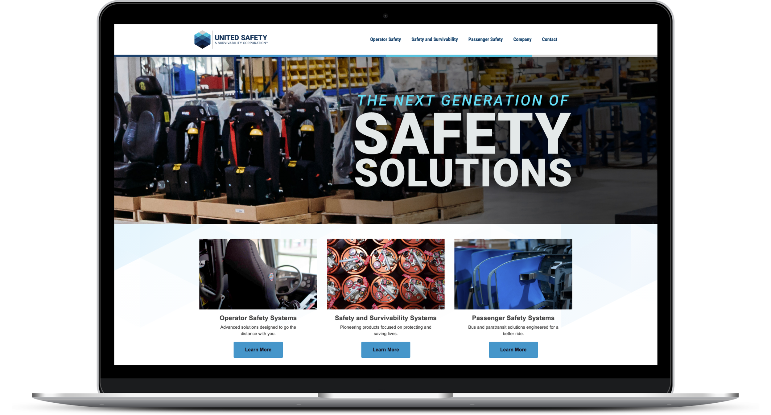
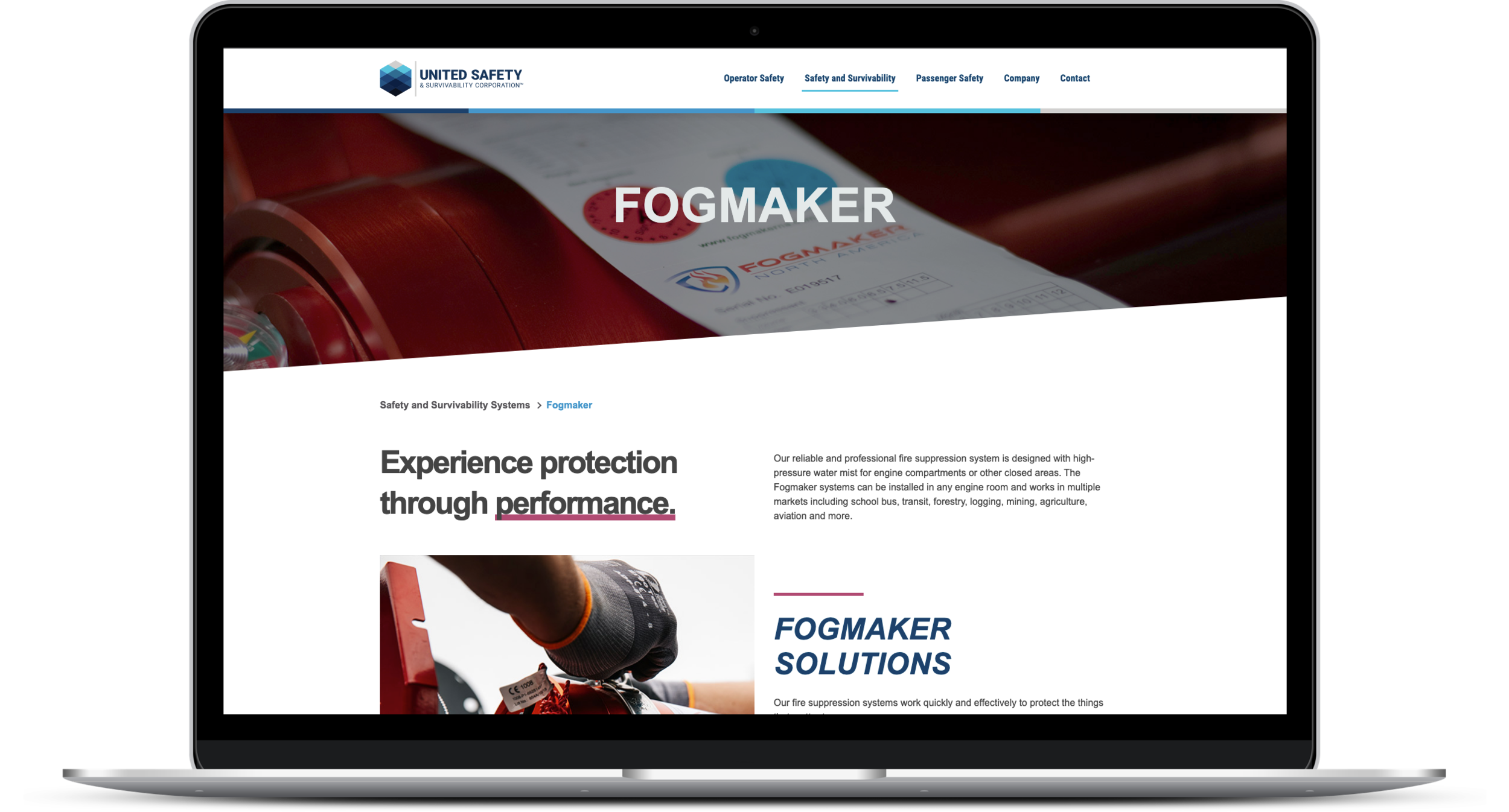
Objective:
United States Seating Company wanted to rebrand themselves as more than a US-based seating company. They didn’t want to lose the equity in the initials USSC however, so they became United Safety & Survivabilty Corporation. We were tasked with a full rebrand from strategy to logo and color theory.
My involvement:
Previously, their site was was not accessible, responsive, usable or updatable. So we built them a fully-responsive, modular website that is both accessible and aesthetically pleasing. Built with reusable modules in Wordpress, the client is also able to make updates as needed, which was helpful during the pandemic.
I did the full site audit, conducted user interviews to determine the full scope of functional needs, as well as created the site architecture, wireframes, prototype, content outline and strategy and website design.
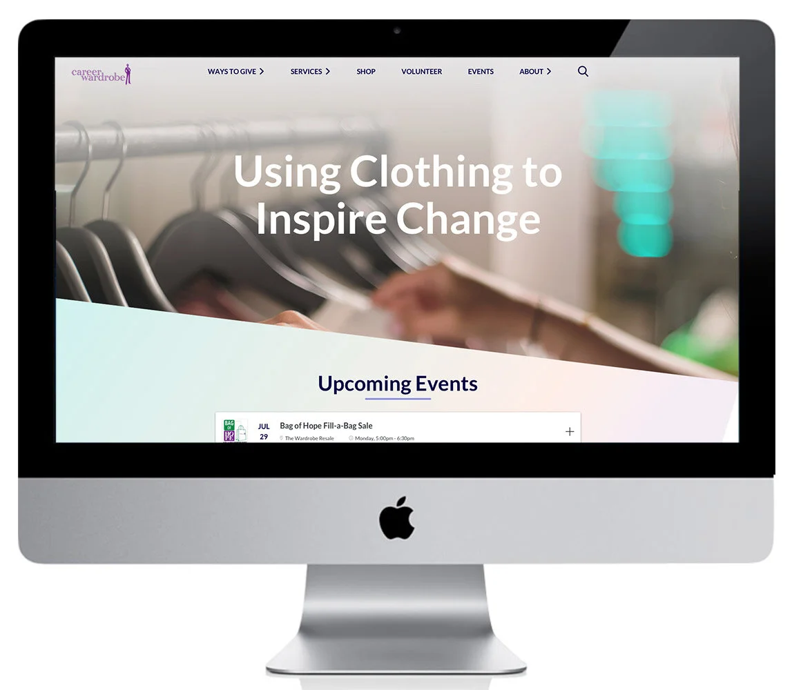
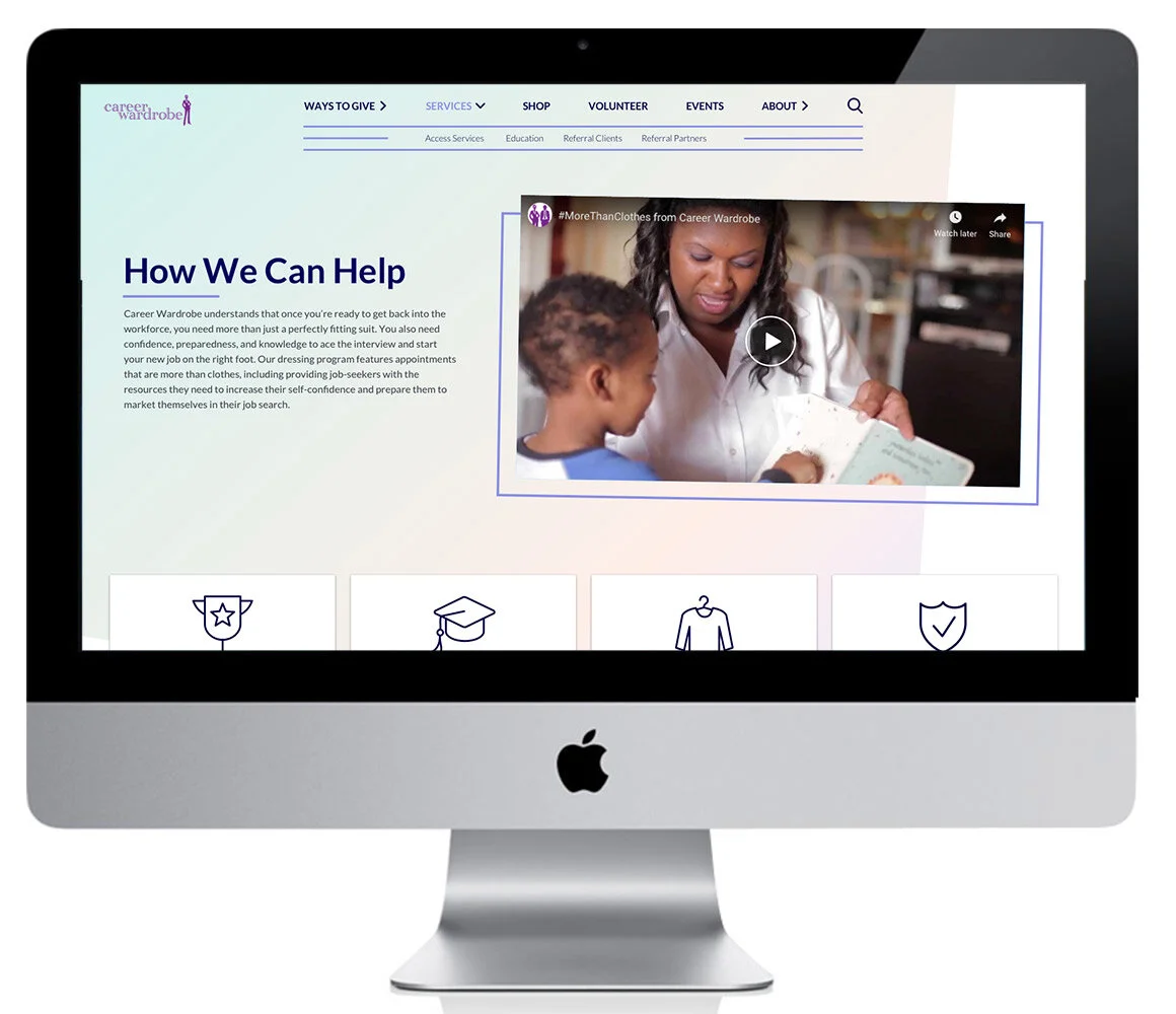
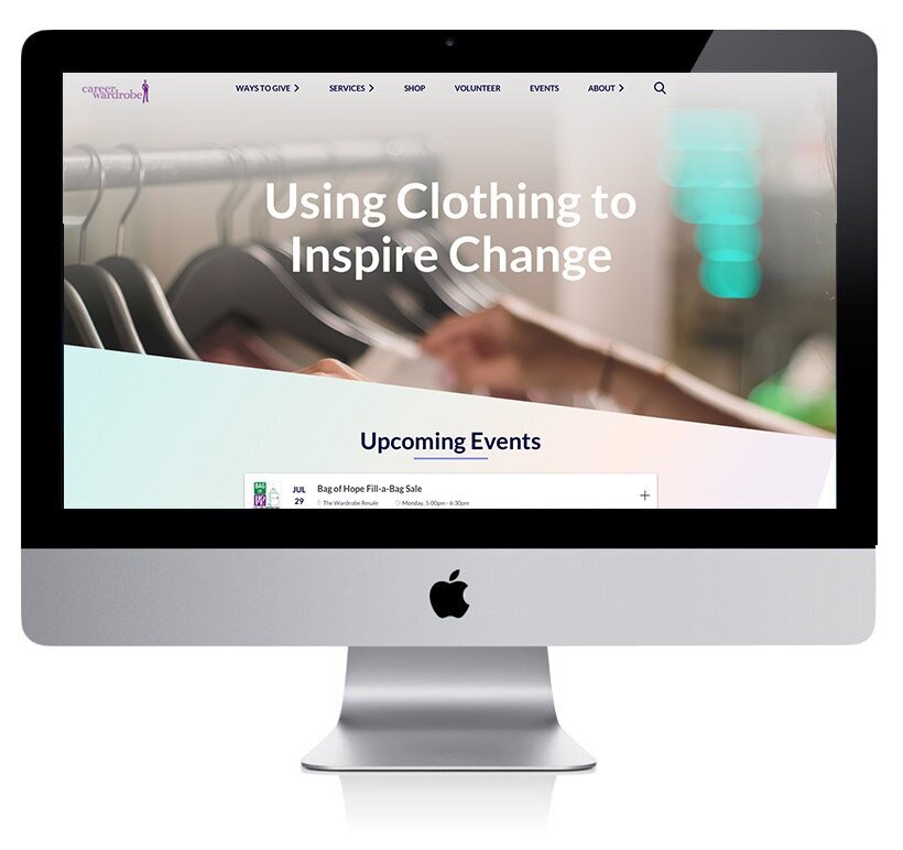
Objective:
In anticipation of their 25th anniversary, The Wardrobe (formerly Career Wardrobe) wanted to give their site a facelift and make it feel more luxurious and exciting.
My involvement:
I was responsible for the site content audit, site architecture, wireframe creation, protoyping, UX/UI design, overseeing the developer, and working with the internal partners at Career Wardrobe.
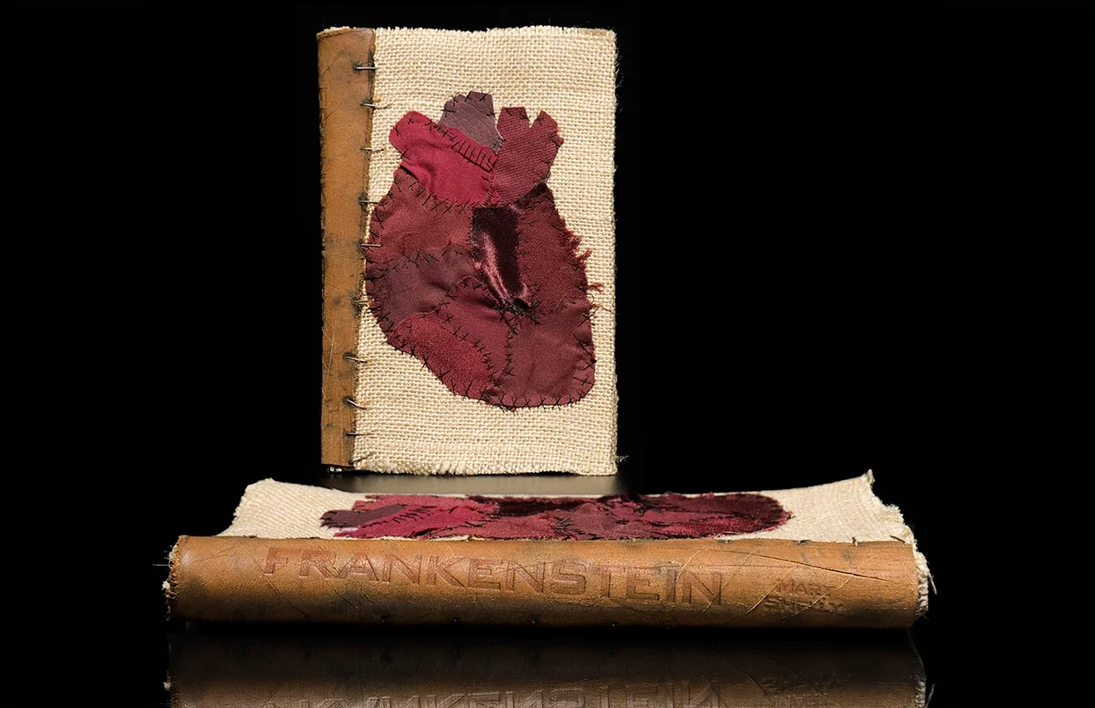
This book design was done in my favorite class in portfolio school and is probably my favorite thing I've ever made.
I loved the process of making all the pieces and felt this design truly showcases what the book is about. I also felt like Dr. Frankenstein putting all the pieces together to create my own monster.